Presentation Tips for Engineers
Recently I’ve had many conversations with colleagues about how to be more effective when presenting technical content. There’s no magic, but here are a few tips I learned in my time presenting to audiences both technical and business. I’ve broken it out into three major areas – of Content, Presentation Style, and Demos.
Content
Content Styles
Given that technical presentations tend to be shared online after events, decide if the content can (or should) stand on its own without you presenting it.
If you pack your slides with text, it’ll stand up well on its own. However – when presented, the content will be absorbed by your attendees before you can present it.
On the other hand, given a slide like:
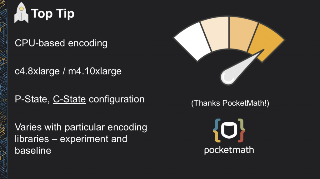
Your audience will keep their attention focused on you as you present, but also helps bring their focus back to the main points if they lose track.
Having said that, if you stumbled upon a slide like that – you’d have no real concept of the context. This can be mitigated in two ways:
Presentation Recordings: As many (e.g. Engineers.sg) now provide recordings of almost every tech event, it’s almost guaranteed that a reasonably attended public talk will be recorded. However, this won’t help for internal presentations, and furthermore many people do not enjoy watching recorded presentations.
Transcripts / Speaker Notes: My preferred approach is to subtitle the video / provide an audio transcript of the presentation, which in English is reasonably simple to achieve using a tool like Microsoft’s Azure Media Indexer, or Amazon Transcribe.
Content Tips
Structure
Most importantly, your content should have a defined structure. Try:
- A problem statement
- An education to resolve the problem
- Actionable takeaways for the attendees
- Relevant follow up / related content
By doing this – you engage your audience early, keep their attention by educating them, and you keep the content fresh in their minds by giving them something to either complete or follow up on after.
Build Up Slides
If you’re presenting a complex slide, for instance an end to end workflow:
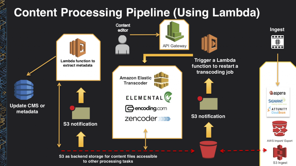
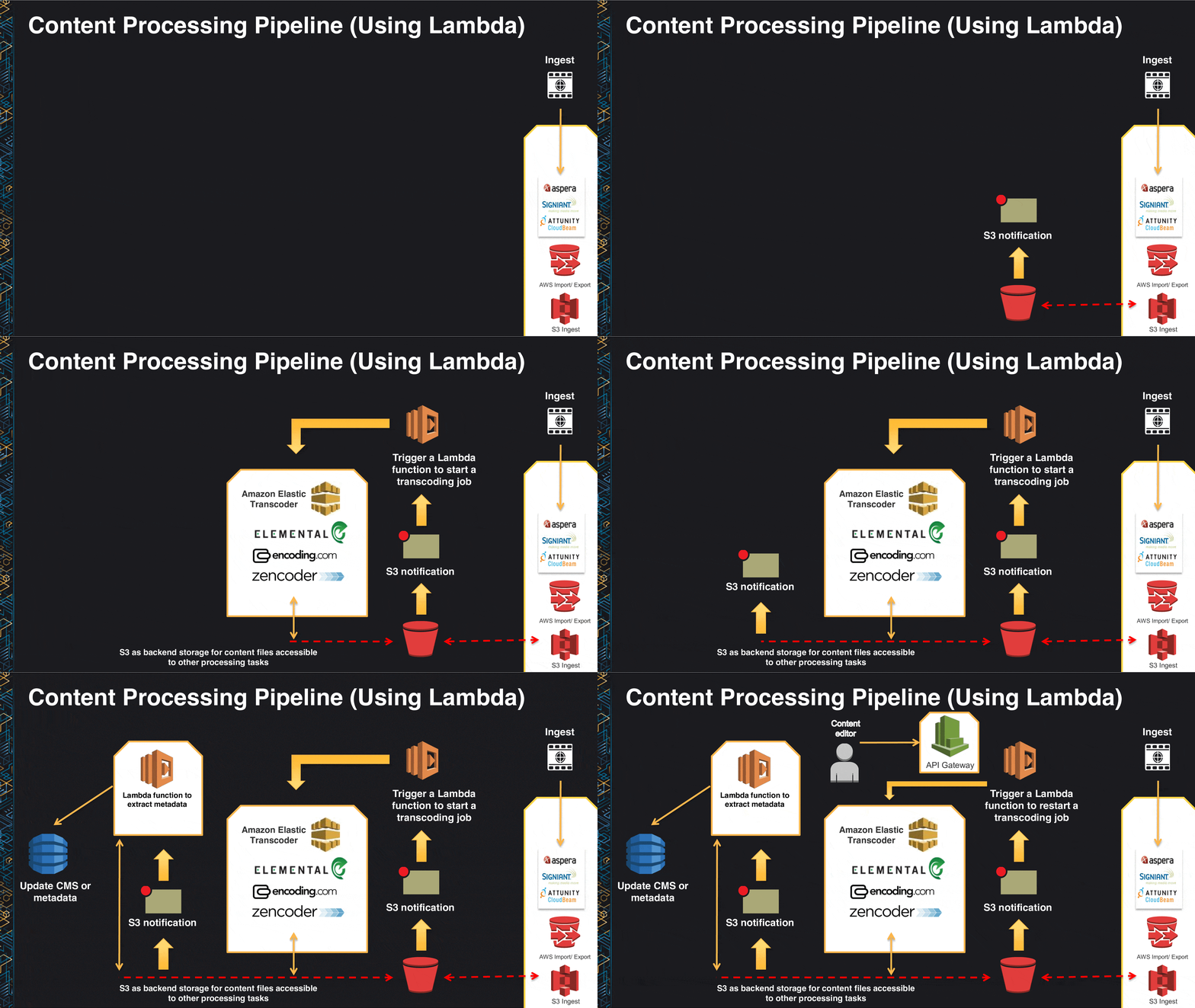
Your audience will be taken aback and try to follow it themselves. Instead, consider building up the slide as you talk through each component:
Images
Be effective using images.
Do not excessively use stock photography and other similar methods to flesh out a deck Instead, use of a few spartan images to augment a page and draw attention to your points.
Taking for example a simple slide:
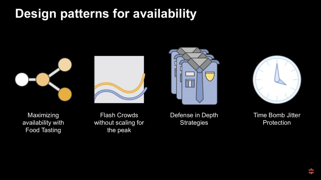
Here there are four simple images – in this case provided by the AWS internal teams as part of the re:Invent asset pack – to help focus the points on this slide. While it doesn’t explicitly call out the image shown as something an attendee will learn from, it helps provide a reference and to track.
Another small consideration is the use of edge softening on images to improve viewer experience. By adding a 1-2 pixel softness in PowerPoint / Keynote, images or screenshots which have been pasted into a document will look much more natural:

Consistency
Have consistent structure throughout your deck, and your content is easier to follow. Consistency of templating is obvious:
- Use the same outline for each slide so your attendees aren’t looking for info
- Don’t switch colours from light to dark half way through a presentation
- Give proper titling where appropriate to help track
But on top, the use of a flow tracking method can help audiences understand transitions between components of the presentation. The 4 frames shown below act as a starter for each component – shown before that information is presented. At the end, during a recap, the same built up image is used to reiterate the points.
![]()
Strongly focussed slides
It’s important when writing a presentation on a complex topic, to keep each individual slide focussed enough in order to allow you to deliver information effectively, in addition to allowing your audience to take in the information you’re giving. Too many points covered on one slide can lead people to confusion
Tell a story
James Whittaker covers this in many posts – but as you’re building your content, think of the story behind what you’re trying to say.
This presentation (video) is a great example of storytelling. The speaker starts out by talking about a fictitious company, but uses it as a way to build out a more compelling presentation. He sets up a problem, progresses it through learning, and gives clear outcomes.
Code Formatting Tips
Just like when coding, code formatting and syntax highlighting matter. Humans are not interpreters nor compilers, so avoid trying to give a block of unformatted text and expect people to follow. Take for instance:
hooks:
    BeforeInstall:
        - location: bi/foo.sh
    AfterInstall:
        - location: ai/foo.sh
    ApplicationStart:
        - location: as/foo.sh
    ValidateService:
        - location: vs/foo.sh
          timeout: 3600
          runas: codedeploy
When talking about the ValidateService component within this, it’d be hard to follow.
By introducing some syntax highlighting and code formatting:
hooks:
    BeforeInstall:
        - location: bi/foo.sh
    AfterInstall:
        - location: ai/foo.sh
    ApplicationStart:
        - location: as/foo.sh
    ValidateService:
        - location: vs/foo.sh
          timeout: 3600
          runas: codedeploy
Here we:
- Embolden the relevant section
- Provide colouration to make it obvious which components are configuration keys, configuration values, and importantly: which components are less important as we’re not referring to them
- Limit ourselves to as few colours as possible
Presentation style
Record yourself
Really, record yourself. You don’t even have to listen. I despise the sound of my own voice. By recording your presentation – you’ll understand how long it runs for, and you’ll also start to understand your presentation style.
This leads into the next issue: crutch phrases.
Crutch phrases
…as I understand it, the long and short of it, is that really coming down to the fact of the matter, at the end of the day, crutch phrases do not deliver value…
Using Crutch phrases (e.g. “the long and short of it”) and fillers (e.g. “so, you know, I mean”) makes it hard for your audience to listen to you. Focus on delivering the message for each slide, don’t rush into it, and make sure everything you say gives value.
Fillers are far more common in every day speech, and the easiest way to resolve it is to simply slow down. A common reason for people to use crutch phrases / fillers is because they’re afraid of the sound of silence.
Pausing
Don’t be afraid to pause. Whether your audience is 5 or 5000, they came to hear you. They’re not going to walk out if you don’t fill every second with some sort of noise – so embrace the power of pausing.
Pacing
A large proportion of my presentations are given in South East Asia, where there’s an enormous amount of English speakers, but typically as a second or third language. No matter the language: don’t rush.
Demos
Everyone loves a demo. If you’re giving a technical presentation, it’ll make it significantly more compelling, and if you’re presenting to a less technical audience, it helps relate an abstract concept to something tangible.
Live Demo
Ultimately most impressive, if you can do a live demonstration it’ll give you additional gravitas and trust from your audience. Live demonstrations obviously carry the most risk, so consider:
Over Preparation
Before your presentation – double check at least:
- Internet Connectivity:
- Firewalling (Ports?)
- Bandwidth
- Latency
- AV Setup:
- Physical (HDMI, VGA, DVI)
- Resolution (high enough to show what you need?)
- Presenter Display (are you assuming you have Presenter Notes?)
- Content size:
- Fonts in terminals / editors (you’re showing code, can anyone read it?)
- Does the content fit within a reduced screen size? (Venue projectors are often limited to 1080p, while even laptop screens are much higher resolution)
Creative Terminal Emulation
If you’re planning on showing something live from the CLI — take advantage of screen or tmux. By attaching the same session on both your presentation laptop, and the display that your audience sees, you can avoid having to switch from mirrored to duplicated screens half way through presenting
Don’t Be Afraid to Fake It
Many configurations take time to deploy. Don’t be afraid of having a configured copy of your demo for each of the stages you want to demonstrate to your audience, to avoid waiting for distribution of changes. This also helps you if you’re short of time, or when a step doesn’t work.
Customise to your audience
Be sensitive of your audience. If you’re doing a demonstration of a product or service, and you can introduce something interesting and relevant to the country you’re presenting in, it’ll pique interest a little more. Be aware of cultural issues – don’t run afoul of offending someone by mentioning something you’re not supposed to.
Say why, not what
As you go through your demonstration, explain the purpose behind each step. It’s easier to follow than just having a laundry list of what was changed
Recorded Demos
Recorded demonstrations are typically much safer, but carry their own challenges – especially around embedding that content into a presentation. A well rehearsed presentation accompanied by a video of the demonstration can be indistinguishable from live, but be cognisant of small gotchas, for instance any dates or times (e.g. mtime/ctime) – eagle eyed attendees will catch you out and undoubtedly tweet about it.
Conclusion
In any presentation, always remember that your audience came to listen and learn from you. You owe it to them to make this as easy as possible.
Use whatever devices are available to you – whether it’s a structured presentation, simple slides, or simply slowing down while you speak – and enjoy it. Teaching others is one of the most rewarding parts of my job, and I hope these tips help you enjoy it as much as I do.
For Code snippet can use the code presenter pro.
Nice! I haven’t tried this before, will give it a go.
I’ve read many tips for presentations, but finding one specifically tailored to engineers like this is pure gold. Specifically, the code formatting is new to me, and it totally makes sense. Thanks, Alex!